Case study · 02
Designing the everyday tools of a dental-supply platform
A six-month internship at VisionX working on a leading dental company's B2B e-commerce platform — where I designed the blog and content system end to end, and worked on the homepage, search, and account management as a junior designer on the team.
Shipped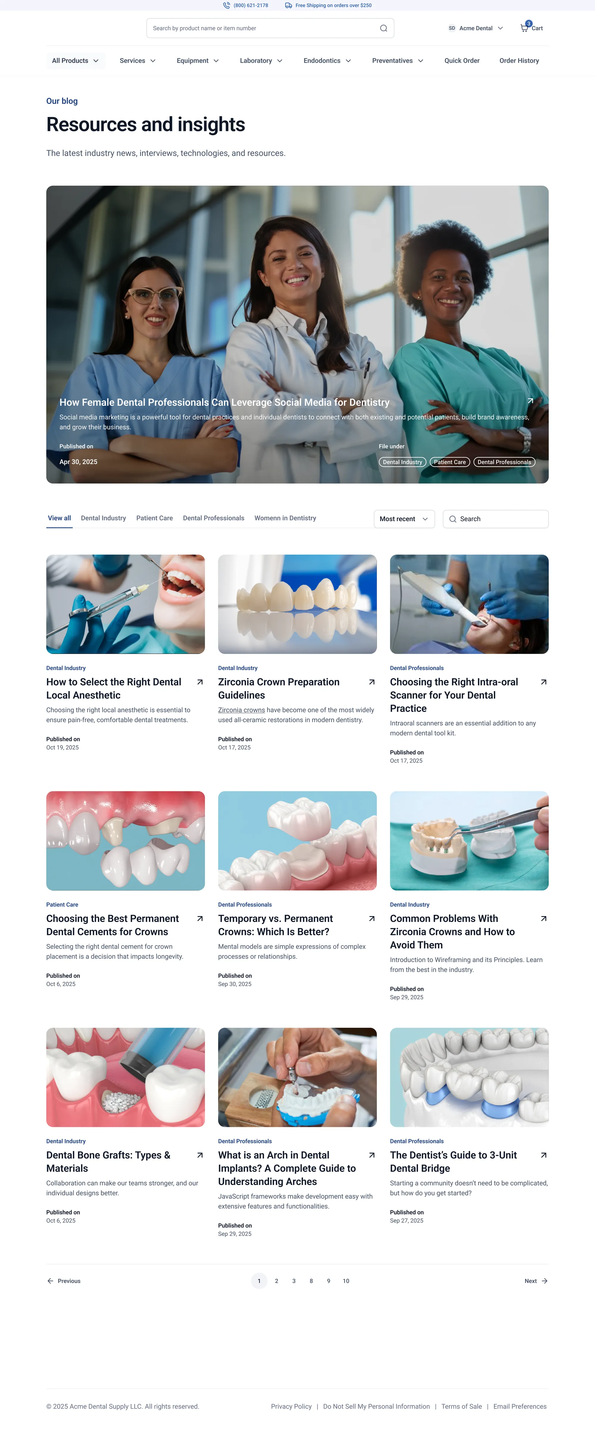
- Role
- UX/UI Designer (intern), VisionX
- Timeline
- 6-month internship, 2025
- Team
- A senior design director set the briefs; I owned the blog and contributed as a junior designer elsewhere.
- Tools
- Figma
What I did
Owned the blog and content system end to end; contributed screens on homepage, search, and account surfaces.
01 — Overview
What this is
The platform is a long-running B2B e-commerce site that sells dental and endodontic supplies to practices across the US — a catalog business with decades of history behind it. During my six-month internship at VisionX, it was the account I was assigned to. The work came one brief at a time: a senior director would hand out a surface — "design the blog article template," "redesign the homepage," "design account management" — and the design would come back for critique.
The blog and content system is the piece I owned end to end. On the other surfaces — account access, homepage, search, account management — I was a junior designer on the team, designing screens as assigned while a senior director held the overall direction. Some of what I contributed reached the live site; most didn't. This case study is honest about that split.
02 — The context
Who this is really for, and what made it hard
The people on a site like this aren't browsing. They're dental office managers, assistants, and practice buyers doing the same handful of jobs over and over: reordering the gloves and anesthetic they're low on, checking what an order cost last quarter, paying down an account balance, reading up on a clinical question between patients. These are repetitive, high-frequency tasks where small amounts of friction add up to real wasted time.
A platform like this also carries decades of accumulated complexity: dense catalogs, B2B-specific needs (statement balances, stored bank accounts, tax certificates, HAZMAT shipping rules), and pages that grew one addition at a time. Across every brief, the same underlying problem kept showing up: the information and the tools were all there — they were just hard to move through quickly.
03 — The work
What I owned, and what I contributed to
Part 1
The blog and content system
The design I owned.
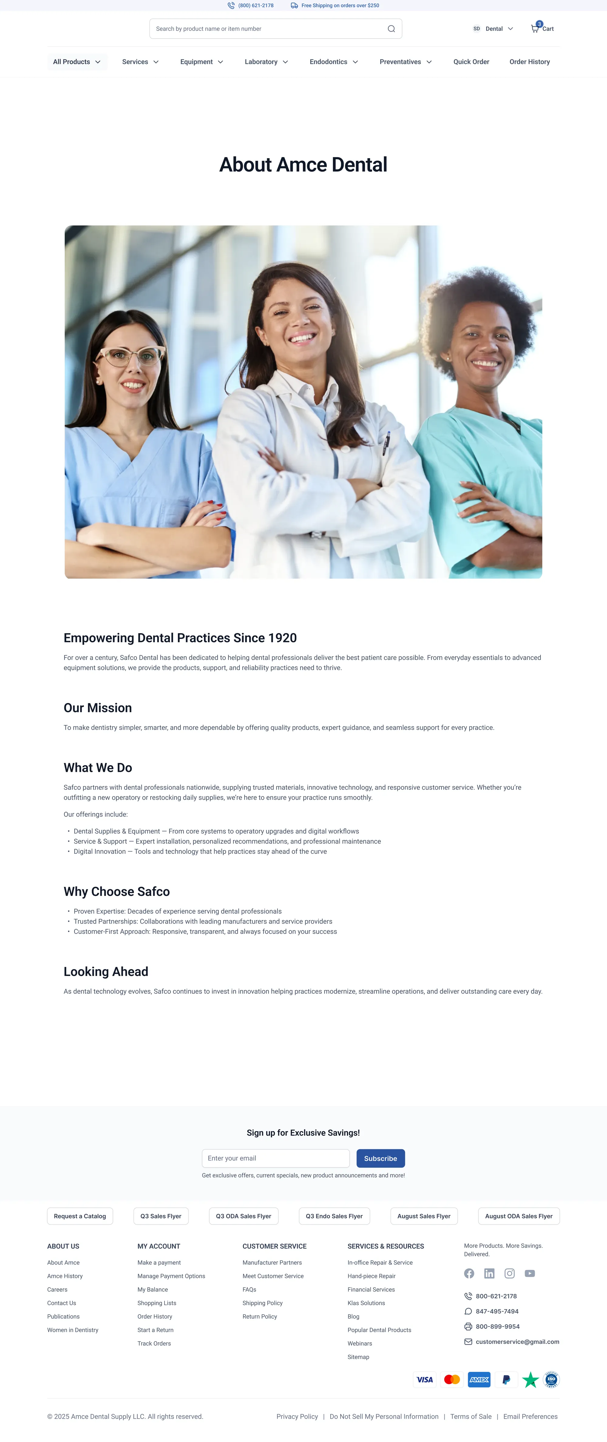
The blog and supporting content pages are a content-marketing and SEO play: educational articles that pull dental professionals in, backed by an "about" surface that has to feel calm and credible. This was the piece I owned end to end : research framing, layout, type, components, and the tie-back to the catalog. No senior designer was holding the direction on this one; the decisions below are mine.
Brief
Design the editorial surfaces from the ground up the article template the whole blog would use, plus the supporting content pages around it. Articles are long, technical, and have to be comfortable for two very different readers: the clinician skimming between patients, and the office manager doing a slow, deliberate read. The system also has to quietly send people back to the catalog without feeling like an ad.
Decisions
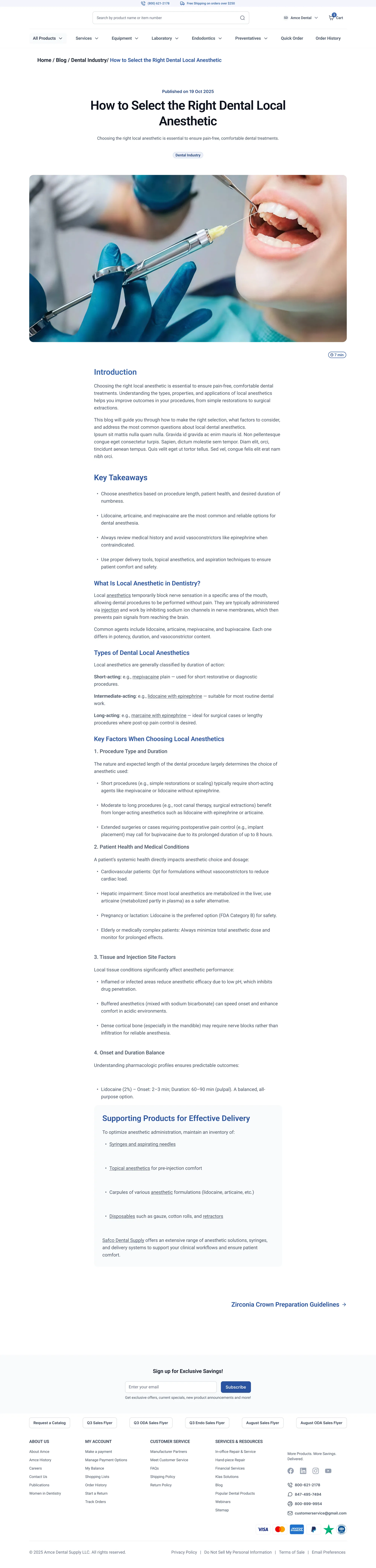
- Built the article template around two reading modes at once: a hero, a short intro, a Key Takeaways block for skimmers, and a cleanly sectioned body for the deep read, so the same page serves the six-second visit and the ten-minute one.
- Set a generous measure, a clear heading hierarchy, and quiet type so a 2,000-word clinical article stays readable on a laptop between appointments. Reading comfort was the whole point.
- Designed a Supporting Products block at the bottom of every article, a small, restrained shelf of items related to what you just read. It ties education back to the catalog without turning the article into a sales page.
- Added a "next article" link to keep the surface working as a system, not a pile of one-offs, so SEO traffic stays inside the content.
- Kept the supporting content pages calm and credible clean type, real photography, a heritage line so the brand voice holds across editorial and product.
- Held the whole thing to one set of components so a writer or future designer can add a new article without re-deciding anything.
Part 2 — Broader platform contributions
On the surfaces below I was a junior designer on the team, designing screens as assigned while a senior director held the direction. Some of what I worked on reached the live site; most didn't.
A — Account Access
Getting existing customers onto a new platform
Brief
The platform was moving existing customers from an old site onto a new one. I worked on the way people get into their accounts on the new platform: logging in, resetting a password, and creating an account, without losing customers who'd had logins on the old system for years. As a junior designer under a senior director, I designed screens against the brief and brought them back for critique.
Decisions
- Login: collapsed to one step. The old route took roughly three clicks to reach the login; the proposed version brought it to one, so signing in is the first thing available.
- Forgot password: ~two clicks, framed as a calm side-path rather than a dead end you dig out of.
- Account creation: one stepped form instead of three heavy pages. Progressive disclosure asks for one thing at a time, so a routine task stops feeling like paperwork.
- A migration note for returning users, a short, plain orientation box so a returning office manager doesn't assume they're locked out.
B — Homepage
A hierarchy of jobs, not a wall of promotions
Brief
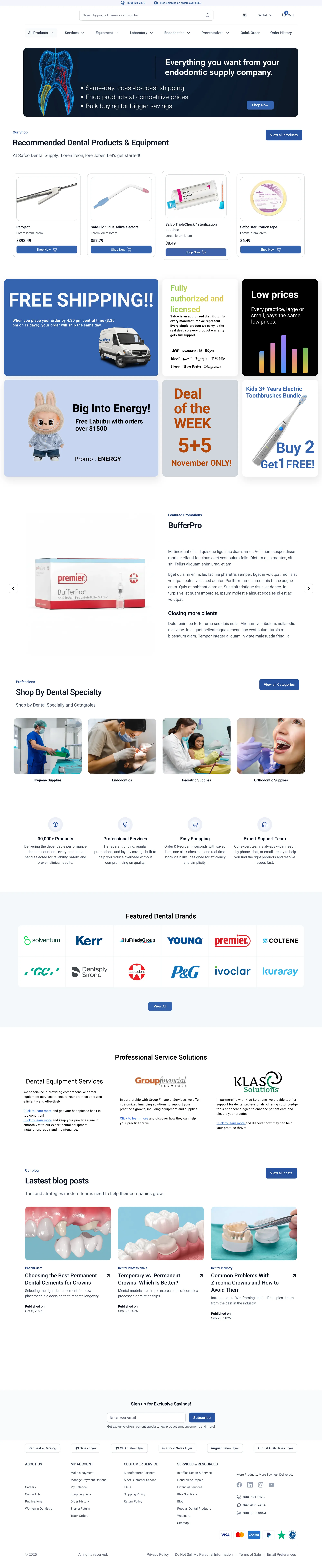
Work on a homepage redesign. The page has two jobs at once: merchandise (promotions, brands, specialties, blog) and launch the one action every returning customer wants, find a product and reorder it. I contributed screens that treated the page as a hierarchy of jobs, so it answers needs in the order people have them. A senior director held the overall direction.
Decisions
- Ordered the page by what people came to do: top answers "what is this / what's on sale"; then "shop the way I think" (recommended, specialty, brands); then "help me run my practice" (service, financial services); then "keep me coming back" (blog, savings signup).
- Pushed the fast reorder path above the promotions — search and specialty entry points sit high so returning buyers get moving in seconds.
- Kept it scannable for a six-second visit — clear section headers, consistent cards, obvious "View all" exits.
C — Search
The front door for a returning buyer, designed as a full system
Brief
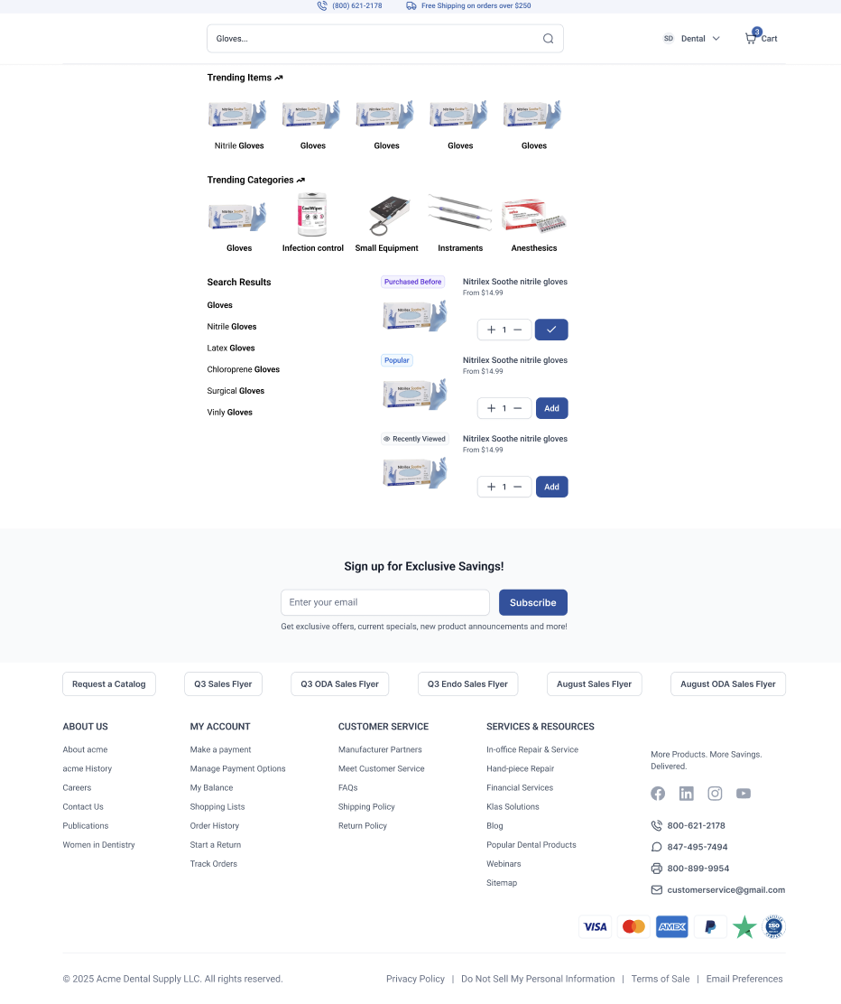
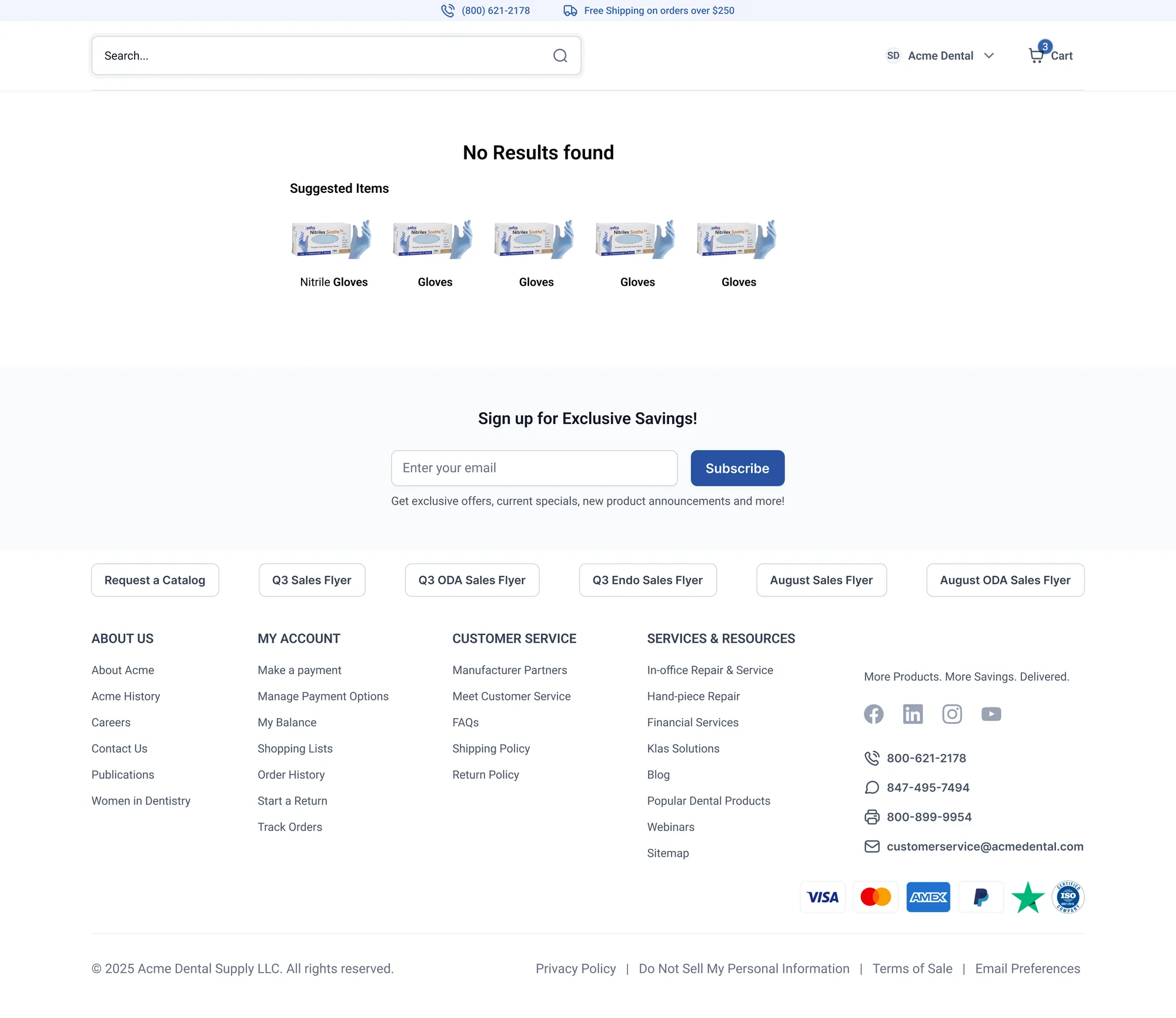
Work on the platform's product search. For a returning B2B buyer, the search bar is the front door, it's how they reorder, not how they discover. I contributed to designing search as a full system, including the states most catalog sites skip: the empty path and the failure path, not just the happy one.
Decisions
- Empty / focused state built for reordering: before you type, it shows Recently Searched + Recently Purchased Items with one-tap re-add.
- Autocomplete that routes by category: typing "Gloves" groups suggestions by category with live counts (Nitrile Gloves (64), Latex Gloves (18)…) so you jump to the right sub-catalog.
- Trending items for the buyer who isn't sure what they came for.
- Results that let you order without leaving: facets on the left, products on the right, each with a quantity stepper and Add.
- A no-results state that keeps you moving: "No Results found" offers Suggested Items instead of dead-ending.
04 — What it adds up to
The body of work, together
The blog and content system is the work I owned, and it's the piece I can point to as my design from the ground up. Around it, the broader platform contributions, account access, homepage, search, account management, are work I helped design as a junior member of the team, inside a direction a senior designer held. Putting them together is what makes the picture honest: one piece I led, and a wider B2B platform I learned on by contributing.
05 — Outcome & reflection
The honest measure
The blog and content system is the work I owned end to end across the six months. On the broader platform surfaces I was a junior designer on the team most of my work did not reach the live site, overall direction wasn't mine to set.
What I learned: my director's push on the login flow, cut the clicks, taught me to question steps I'd assumed were necessary, and I carried that into every surface after. The quieter lesson was designing for the unglamorous high-frequency tasks, where the win isn't a beautiful screen, it's the office manager getting back to their patient sooner. If I picked it back up, the next step is the thing I didn't get to do: put these flows in front of real dental office staff and watch where they get stuck.