NWIH REDESIGN · CASE STUDY 01
A mobile-first redesign for an opioid treatment clinic
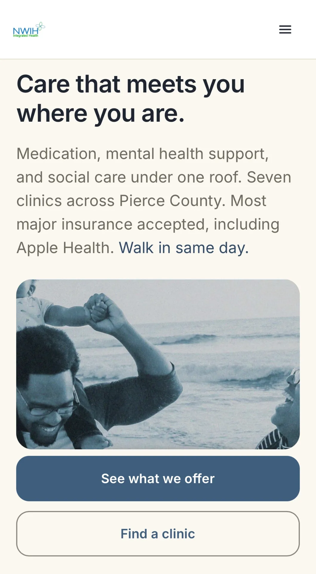
A mobile-first redesign of the website for Northwest Integrated Health, an opioid treatment provider in Pierce County, Washington.
- Role
- Product designer, UX researcher
- Tools
- Figma · Claude Code · Lovable (React + Tailwind)
- Team
- Self-directed
- Timeline
- April – June 2026
01 · CONTEXT
Who the site is for
Northwest Integrated Health (NWIH) treats opioid use disorder at clinics across Pierce County. It offers methadone, buprenorphine, and naltrexone, and takes walk-ins the same day. Most of its patients are on Apple Health, Washington's Medicaid program.
The website is for two people. The first is someone deciding whether to get treatment, often after earlier attempts. The second is a family member checking the clinic out for them.
Both usually arrive on a phone. An estimated 83% of visitors do. The site they landed on was built for a desktop.
02 · PROBLEM
What the old site got wrong
The site was outdated and built for desktop. On a phone, the first scroll gave a potential patient nothing they could act on.
The useful information existed. Which insurance is accepted, who the providers are, where the clinics are. It sat inside accordions and dropdown menus, spread across different pages. Every answer cost several taps.
For someone unsure about treatment, each extra tap is a chance to give up and close the page.
03 · PROCESS
How I worked
Research
I started by learning what NWIH does and who it serves. Then I audited the existing site page by page and compared it against 6 competitor clinics. I talked to patients about the old site. From all of this I built 2 personas and a jobs-to-be-done list. A jobs-to-be-done list names what a person is trying to get done, in their own terms.
What the research said
Two findings shaped everything after. People gave up when they had to dig through menus. And they could not tell which insurance the clinic accepted.
Design
I built the design system first, so every screen drew from one set of tokens for color, type, and spacing. I prototyped in Figma and Claude Design, then built the working site in Lovable.
04 · SOLUTION
What I changed
I redesigned the first scroll so it carries what a potential patient needs to make a decision. Each change answers a need from the research. Some were needs people stated. Others they would not say out loud.
Insurance moved to the home page. All 10 accepted plans, with Apple Health named. Nobody has to open an FAQ to find out if they are covered.
Providers moved up. Named clinicians with credentials, out of a buried menu and onto the home page.
Location cards added. One card per clinic with address, phone, and a walk-in note. Tapping a card opens directions.
A plain-language privacy note added. Federal law, 42 CFR Part 2, protects treatment records. The page says who the clinic will not share records with, including courts and probation officers. That fear is one people rarely voice.
05 · OUTCOME
Where it stands
6 providers
Moved from a buried menu to the home page.
0 of 6
None of the 6 competitor clinics state upfront how privacy is protected. This one does.
~83% on phones
The old site was desktop-first. The redesign is built for how nearly everyone arrives. Estimated.
I presented the redesign to NWIH's CEO, medical director, and operations director.
They liked the location cards: one card per clinic, with the address, phone number, and directions a tap away.
They also wanted changes. The site was too long for someone in crisis. They asked for a single page that gets a person to the nearest clinic first. I am working on version 2 now.