Case study · 04
Built for the manager who can't be on-site
A mobile-first B2B parking enforcement app for commercial property managers who run multiple lots remotely designed so they can triage violations, review evidence, and take action without ever being in the lot.
Concept prototype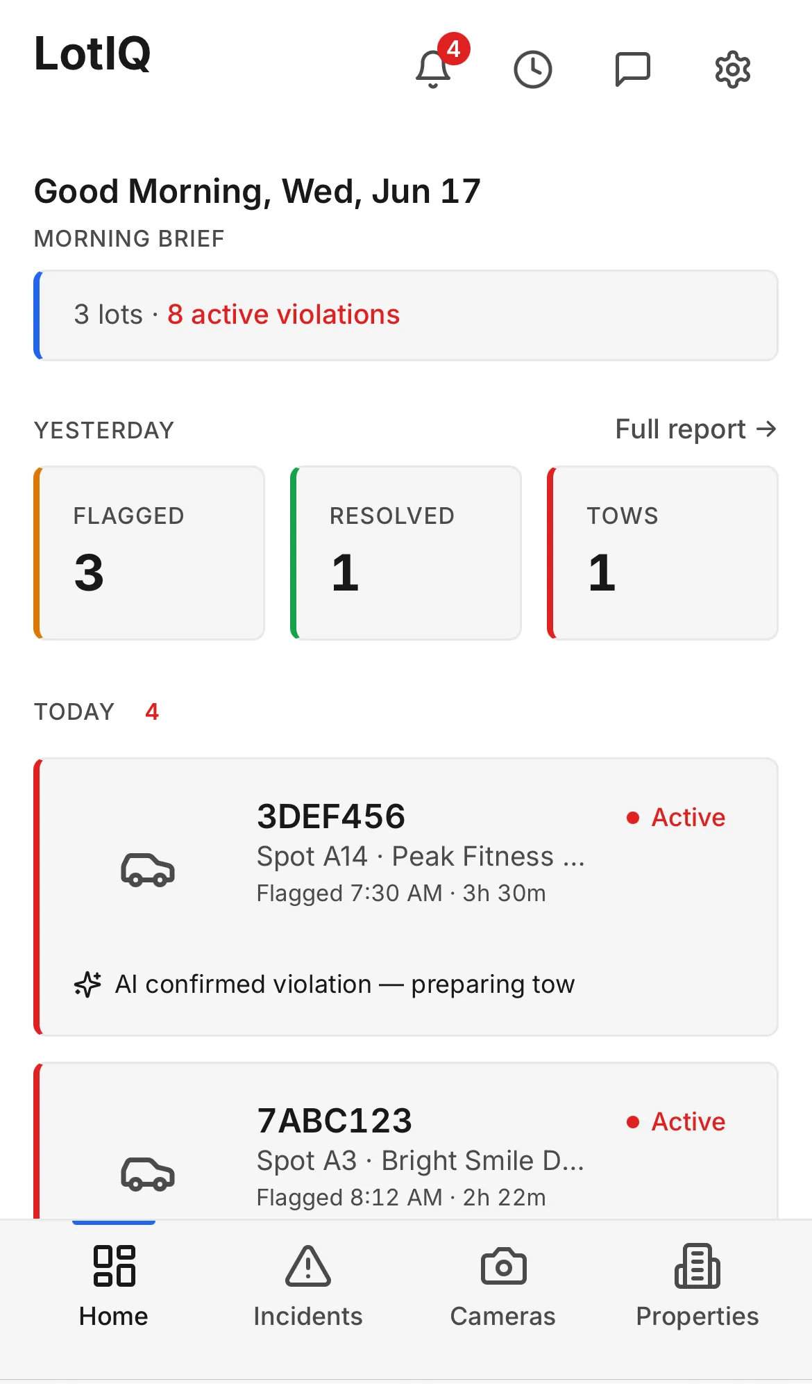
- Role
- Product designer — sole designer
- Timeline
- April - May 2026
- Team
- Self-directed, on a real product brief. My mentor, who built and launched LotIQ, gave me the research foundation and coached the process; the design decisions were mine.
- Tools
- Figma · Lovable (React + Tailwind)
What I did
Sole designer — research synthesis, IA, onboarding, design system, and the working prototype.
Where it landed
Interactive prototype covering onboarding through daily enforcement, at lotiq-spot-watch.lovable.app.
01 - Overview
What this is, and why it existed
LotIQ is a mobile parking enforcement app for commercial property managers. Not lot attendants. Not a security desk. The person it's built for, call him Michael, is a 42-year-old property manager with fifteen years of experience, three or four mixed-use properties, and fifteen to thirty tenants at each one. He's almost never physically in a parking lot. He's in meetings, at his desk, handling maintenance calls, and checking his phone in between.
Parking is his most time-consuming problem. He has no remote visibility into what's happening across his lots. When a towing complaint comes in, he has no evidence to show the tenant. His enforcement staff costs him between $38,000 and $48,000 a year per person. And tenant communication about parking issues happens through fragmented channels text, email, phone, none of it logged.
This was a self-directed design exercise built on a real product brief. My mentor, who built and launched LotIQ gave me the research foundation and coached me through the process. I made all the design decisions: information architecture, property hub structure, onboarding flow, design system, and working prototype.
02 - The Problem
What was broken, and for whom
Michael doesn't need a parking camera system. He needs a way to manage parking as a business problem remotely, across multiple properties, with evidence he can act on and show tenants.
Three needs consistently go underserved by existing tools.
He needs to read across all his properties at once, not one at a time.
Most parking enforcement tools are built property-by-property. That's fine if you manage one lot. Michael manages three or four simultaneously. A single-property view forces him to exit, switch context, and re-enter for each one the exact cognitive overhead his day is already full of. He needs one screen that shows him everything, ranked by urgency.
He needs to start his day in control, not in reaction.
Michael checks his phone first thing in the morning, often before he's near any property. If the first thing he sees is a live list of active violations, he's immediately in firefighting mode before he knows whether anything actually needs his attention. What he needs is a summary: what happened yesterday, how it resolved, and whether today is looking normal. Two minutes to triage, not two hours of anxiety.
He needs evidence before he acts - and a record after.
Towing a car is a high-stakes decision. Tenants push back. Without a timestamped photo, a camera source, and an audit trail he can show someone, Michael has no defensible position. Every action he takes needs to be logged automatically - not because he filled something in, but because the system did it for him.
03 - Process
The decisions that mattered
Four choices defined the architecture. Each one is a response to a specific thing Michael's current tools get wrong.
Decision 1
Multi-property architecture (the Property Hub)
Most property management tools are built property-by-property. That fails Michael, who manages three or four lots simultaneously. A single-property layout would force him to exit, switch, and re-enter for each one - the exact cognitive overload his persona names as a core pain point.
I built the Properties tab as a hub: every lot on one screen, with live status per property, color-coded by urgency (red = active violation, orange = flagged). He reads across all of them in one pass. If something needs attention, the color tells him before he opens anything.
Jobs-to-be-done anchor: "I want a single-screen view of all lots and active issues so I can triage my day in under two minutes."
Live prototype — Properties view
Open in new tab ↗Decision 2
Morning brief over a raw violation list
Opening to a live incident list front-loads anxiety. Michael checks the app first thing, often before he's near any property. A live list of active violations pulls him into reactive mode before he even knows whether anything is actually wrong.
The Home tab shows a summary instead: yesterday's resolution rate, today's active count across all lots, and the timestamp of the last camera scan. He can triage the whole system in under two minutes, then decide whether anything needs immediate action. The list is still one tap away but it's not the first thing he sees.
Jobs-to-be-done anchor: "When I'm off-site for hours, I want to feel like nothing is slipping through the cracks so I can stay focused without background anxiety."
Live prototype — Morning Brief dashboard
Open in new tab ↗Decision 3
Cross-property incident filter (one screen, not separate views)
Splitting incidents by property would mean separate screens one per lot. A manager with four active properties would have to navigate between four different views to see what's happening across all of them. That's the problem the Property Hub already solves for status; the same logic applies to incidents.
The Incidents tab is a single screen with a property filter dropdown at the top. Michael pivots between properties without navigating away. When he's triaging multiple active violations across different lots simultaneously the scenario where he needs speed most, he stays in one place.
Live prototype — Incidents view
Open in new tab ↗Decision 4
Stepped onboarding with transparent pricing
LotIQ is a B2B product. Michael is not a consumer signing up for a trial, he's a property manager evaluating a business tool. Structured, progressive onboarding is standard at this tier and expected.
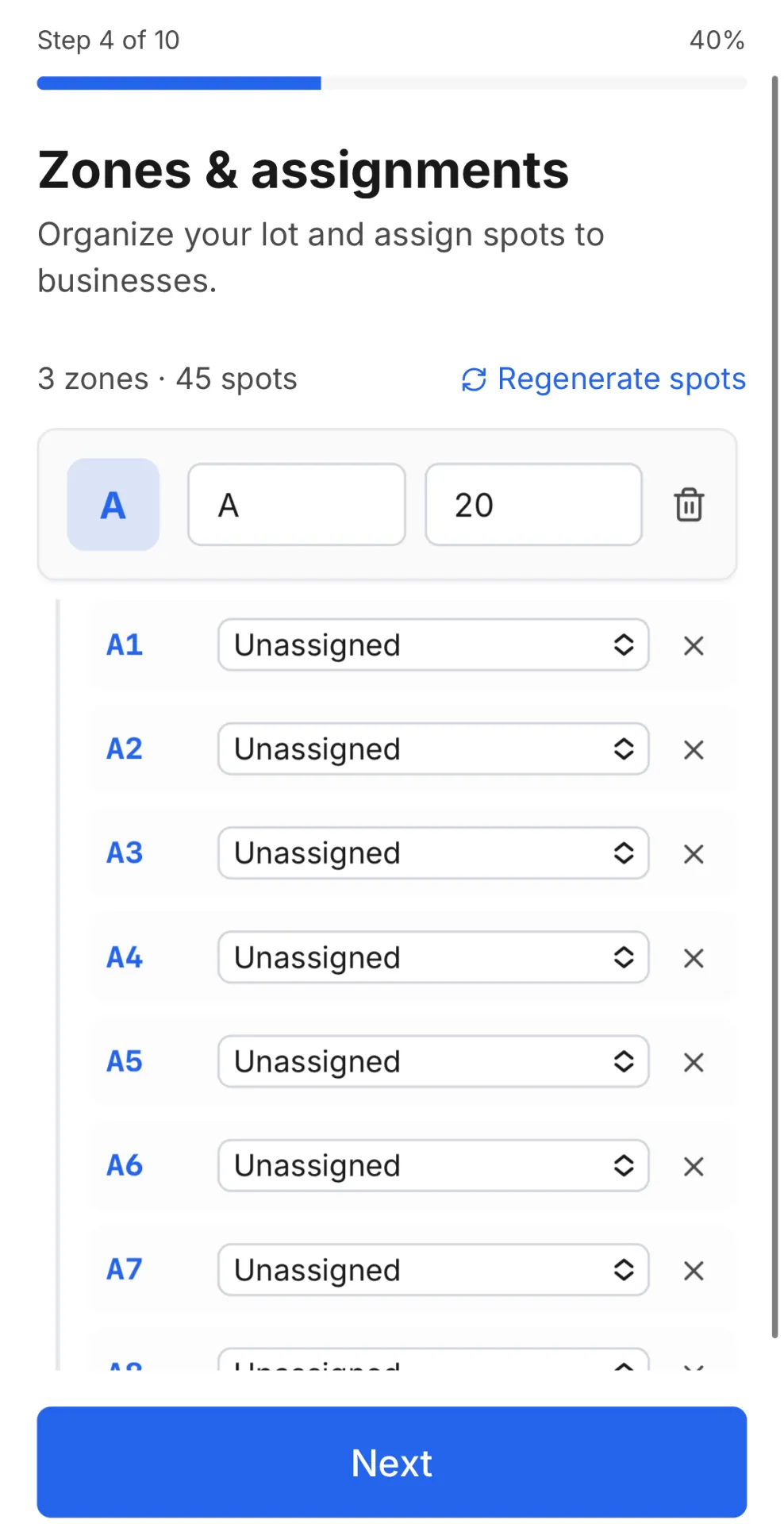
The setup is genuinely complex: he needs to configure parking zones, assign spots to tenants, connect cameras, and register a towing partner before the app can do anything useful. Dropping all of that on one screen would cause abandonment. The stepped onboarding walks him through each piece sequentially in ten steps, with each completed step building a clearer picture of his configured system.
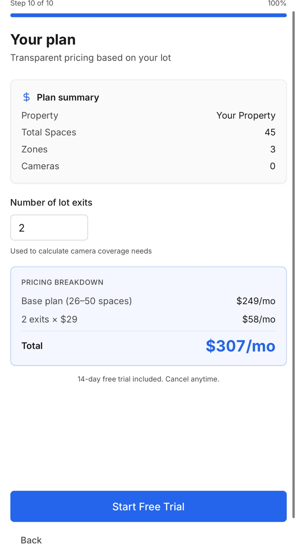
The pricing screen sits inside onboarding itself, calculated in real time from his actual lot size and exit count, not a fixed plan page he finds later. He sees his monthly cost, understands the formula, and can run the ROI math himself against his current enforcement staff cost ($38,000–$48,000 per year per person) before he commits. That transparency is the trust mechanism, not a trial button, not a "contact sales" wall.
Business rationale: a fully configured account on day one drives retention. Pricing shown inside the process prevents sticker shock after commitment.
04 - Solution
What I built
The app ships as four core tabs, a complete onboarding flow, and a set of supporting screens — a full working system, not a core-loop prototype.
Incident detail — evidence and action
Live prototype — Incident detail
Open in new tab ↗Cameras — live monitoring by property
Camera feeds grouped by property in a 2×2 grid
Open in new tab ↗Activity history — the paper trail
Activity history log of past violations and resolutions
Open in new tab ↗Onboarding — ten-step setup flow
Ten steps, welcome to confirmation — collapsed so the flow reads as one decision, not twelve screenshots.
Settings
Settings screen — account and app preferences
Open in new tab ↗05 - What's Next
Where this goes from here
V1 is a complete, working prototype. Two directions are next in development.
Reporting surface
Michael doesn't just manage violations, he reports up to ownership. A monthly operating cost view (enforcement activity, tow volume, cost-per-incident vs. staffing baseline) would give him something to bring to those conversations. That's the next major surface.
Desktop portal for multi-property overview
The mobile app handles day-to-day enforcement. But portfolio-level review comparing performance across multiple properties over time, may work better on a larger screen. A lightweight desktop view for ownership presentations is under consideration.
06 - Reflection
What I learned
The hardest thing about designing LotIQ wasn't the complexity of the system, it was resisting the urge to simplify it for the wrong reasons.
Every instinct said to make onboarding shorter. But Michael isn't a consumer. He's a property manager who needs his lot configured correctly before the app can do anything useful. Shortening setup for the sake of it would have meant an app that felt easy to start and useless to run. The right move was to make the complexity navigable, not to pretend it wasn't there.
The same instinct showed up in the home screen decision. It would have been easier to open to the incident list, that's the "active" view, the one that feels like something's happening. But Michael doesn't need more things happening. He needs to know whether anything requires his attention right now. That's a different design question than "what's active," and it took sitting with the persona for a while to feel the difference.
The property manager persona kept me honest throughout. Every time I was tempted to optimize for a simpler-looking screen, I'd come back to Michael: someone juggling three properties, fifteen-plus tenants each, checking his phone between meetings. That framing didn't just define the architecture - it held the architecture in place when the design impulse said to simplify.
If I were to continue this project, I'd want to put the onboarding flow in front of a real property manager before touching anything else. Ten steps is a hypothesis. The right number is whatever number doesn't cause abandonment before the first lot goes live.