NWIH redesign · Case study · 01
Designed for people who are still deciding
A mobile-first redesign of a Pierce County opioid-treatment clinic's website, built around how patients actually arrive, on a phone, in short sessions, before they ever call.
- Role
- Product Designer - sole designer. Research, structure, writing, design system, and prototype.
- Team
- Self-directed. I ran it end to end.
- Timeline
- [ADD TIMELINE]
- Tools
- Figma · Lovable (React + Tailwind) · Material Design 3
01 - Overview
What this is, and why it existed
Northwest Integrated Health (NWIH) is a group of clinics in Tacoma, Puyallup, and Lakewood that treats opioid addiction. Instead of sending people to separate places for medical care, mental health support, and social services, it does all of it under one roof. Most of the people it serves are on Apple Health (Medicaid), and most of them find NWIH on their phone.
The old site was built for desktop, opened with shaming language, and hid its best information behind menus and FAQs. I redesigned it on my own: I figured out who the site was really for, compared NWIH to its competitors, rebuilt the structure and writing, created a design system, and built a working prototype, then presented it to NWIH's leadership.
02 - The problem
What was broken, and for whom
The old site was built for someone sitting at a desktop with time to browse. That's not who shows up. The real visitor is someone like Marcus, 36, has tried treatment twice before, looking things up on a cracked phone with patchy service, in quick visits, before he's ready to talk to anyone. Or Diane, 61, a retired medical receptionist checking the place out for her grown son after years of being let down, looking for real details and a page she can send him without it feeling like she's cornering him.
The site failed both of them in three ways.
It used language that pushed people away. The home page said the clinic helps "keep them clean," one of the most shaming ways you can talk about addiction, and mentioned how jails and drug courts constantly refer people there. To a man worried about his probation, that reads as: this place is part of the system I'm trying to get away from.
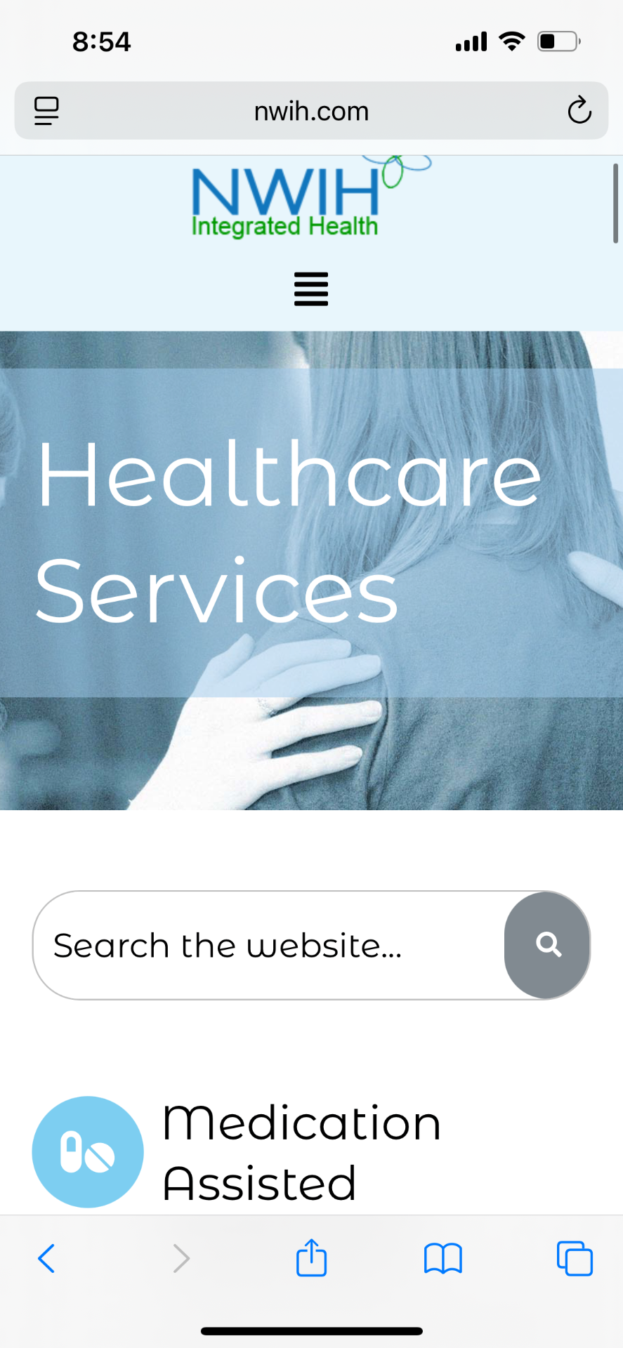
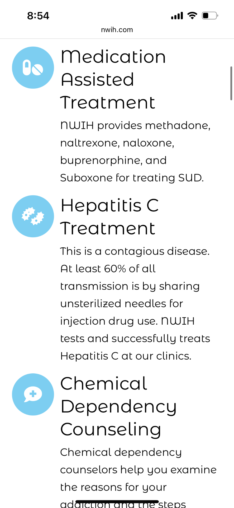
The best information was the hardest to find. When I compared NWIH to other clinics, the surprise was that NWIH already had the strongest material around: real named providers, clear information on which medications it offers, same-day walk-ins. But all of it was buried under menus and FAQs. Someone I tested the site with said it was "demotivating to keep going through tunnels to find what I need," and "I don't know what insurances they take and need to dig deep to find it."
And none of it was built for a phone, even though that's how nearly everyone arrives.
83% of visitors come on a phone, and the site was designed for desktop first.
The question I set out to answer: How do I make the help NWIH already offers easy to see in the first few seconds, for someone who's nervous, on a phone, on a bad connection, and afraid of being judged?
03 - Process
The decisions that mattered
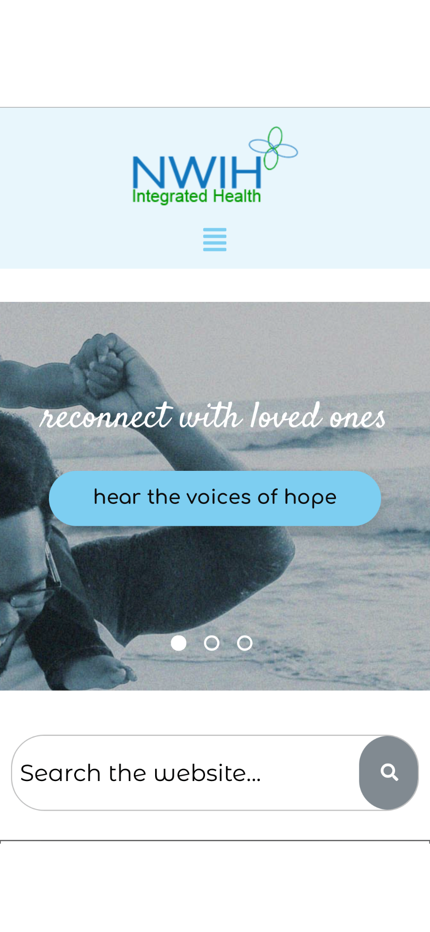
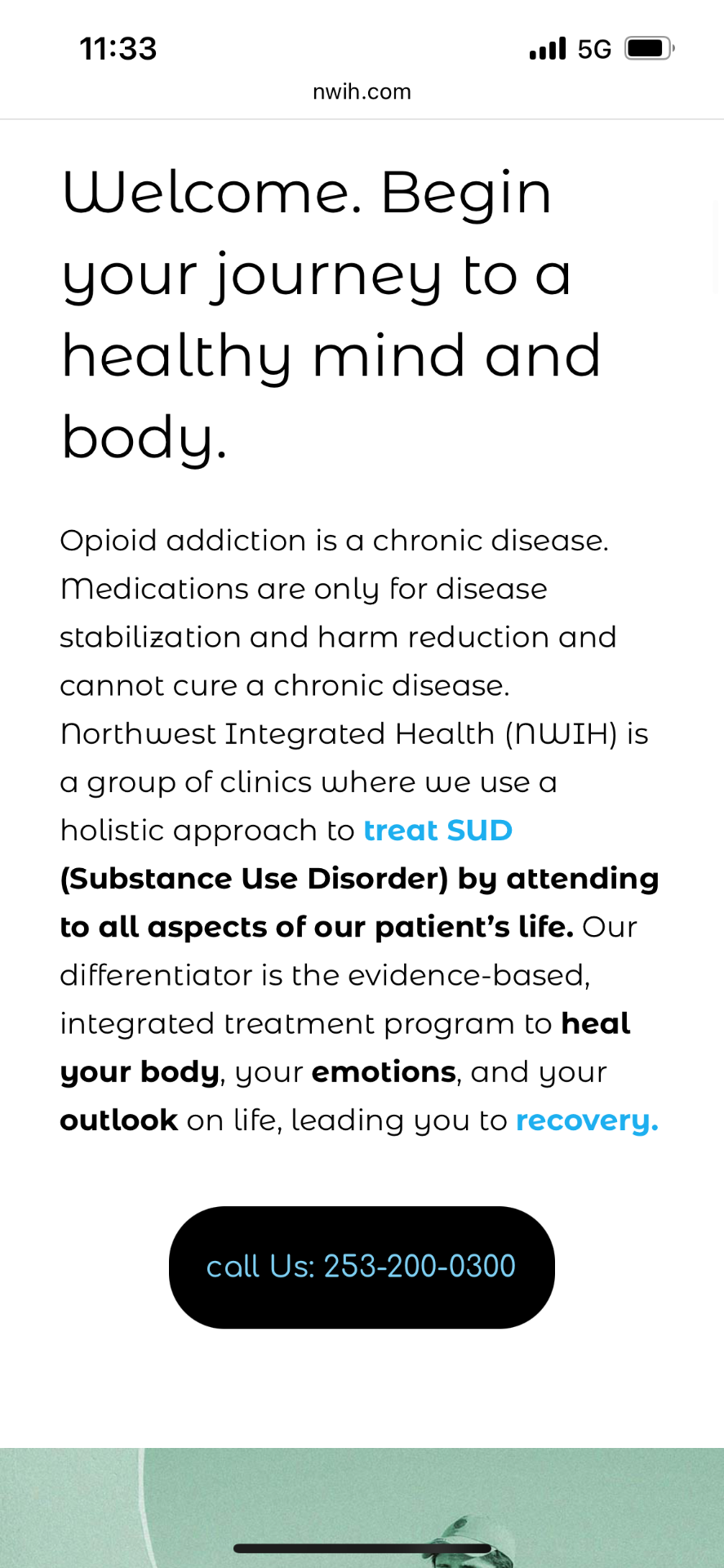
Three choices made the biggest difference. For each one, here's the old NWIH page next to my redesigned version.
Decision 1
Design for people who are still deciding, not people ready to sign up
The people who land on this site usually aren't in an emergency, they're looking into their options. Marcus reads a bit, closes the tab, and comes back another day. Pressure pushes him away. But every competitor site I studied does the opposite: the first thing you see is a "Request Appointment" button or a slogan like "Get your life back," asking you to commit before the site has earned any trust. Diane won't even share a site like that with her son, it feels like an ambush. So I built the site to let people read and come back at their own pace, with nothing rushing them.
Decision 2
Show what's already there instead of starting over
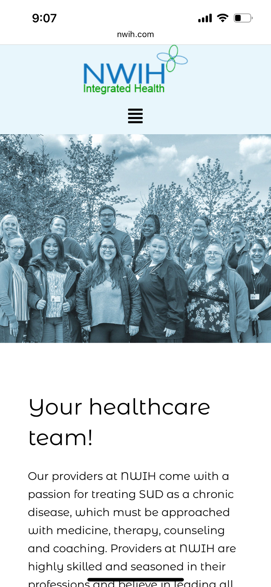
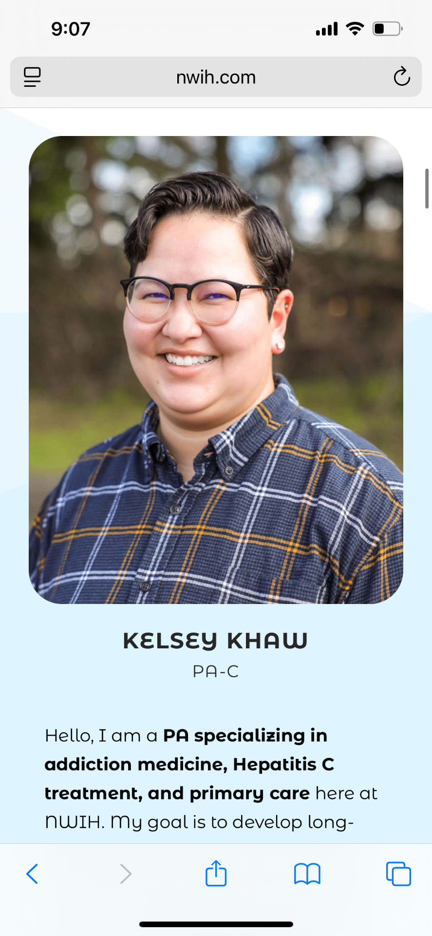
When a site is this rough, the urge is to throw it out and start fresh. But comparing NWIH to other clinics showed it already had the best material: real providers with their names, photos, credentials, and how long they'd worked there; clear information on which medications each clinic offers; same-day walk-ins. None of that was missing, it was just hidden, two menus deep or stuffed inside an FAQ. So instead of writing new content, I pulled the good information that already existed up to where people could actually find it. Nothing new had to be written, which is also why the clinic could realistically say yes to it.
Decision 3
Earn trust by what the site does, not by saying "trust us"
The biggest fears for someone like Marcus are: will this be kept private, especially from courts or probation, and will they turn me away if I've relapsed before. The easy fix is a banner that says "No judgment here." But telling someone you won't judge them basically announces that judgment was on the table; it makes things worse. So instead of saying it, I built it in. I cut the shaming language, added a clear note about privacy right where people enter their information, stated plainly that a past relapse doesn't disqualify anyone, and made sure the sign-up form never requires a home address, because asking for one quietly tells someone without a home that they don't belong here.
04 - Solution
What we shipped
The redesign gives people the answers in the order they actually worry about them: can I afford it and am I accepted, will I be treated with respect and kept private, and who are the actual people here, all in the first few scrolls, on a phone.
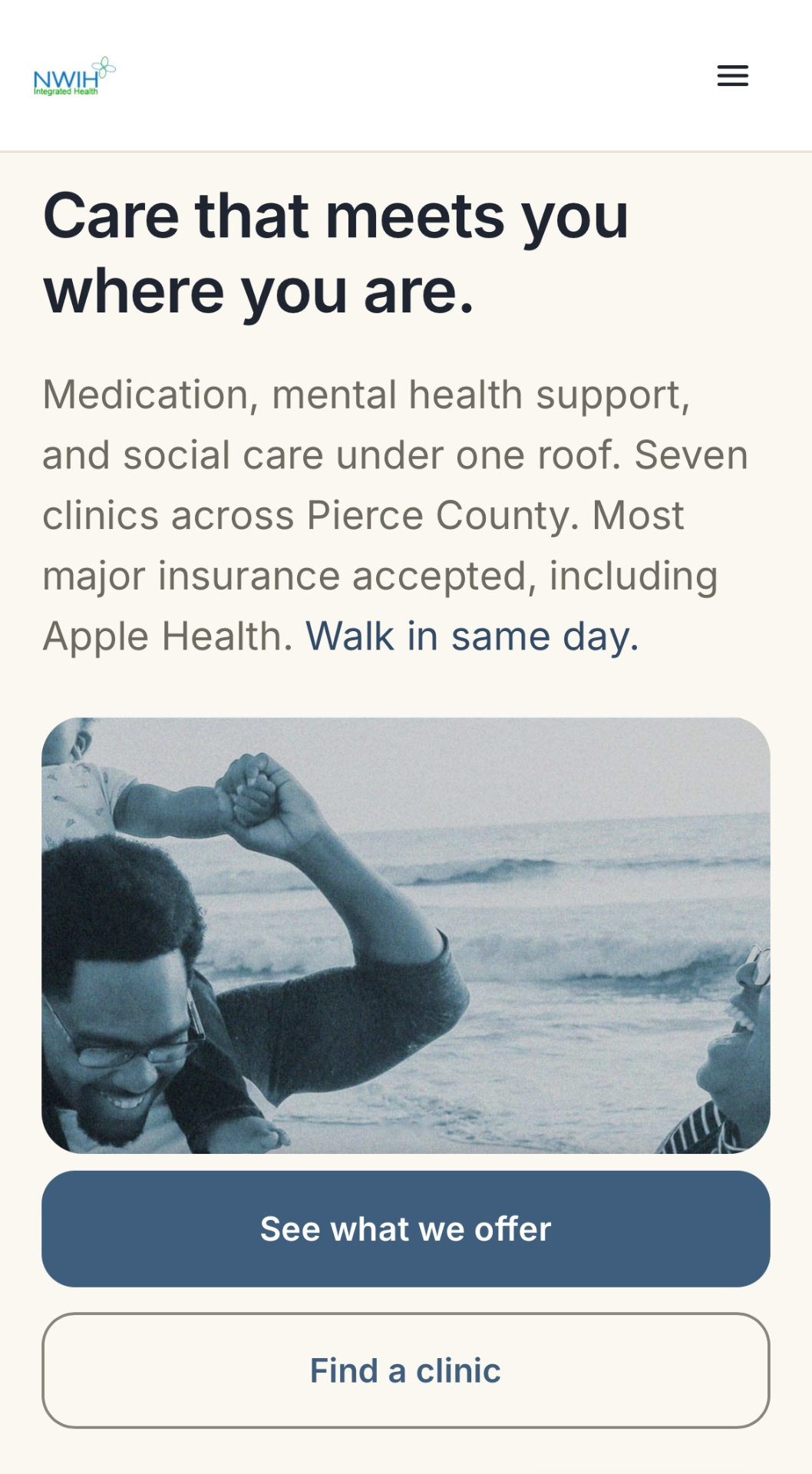
"Care that meets you where you are" replaces "Begin your journey to a healthy mind and body." Whether you're accepted (Apple Health) and that you can walk in the same day sit right at the top. Tappable cards for all seven Pierce County clinics open in Google Maps. The line that a past relapse doesn't disqualify you appears before any of the heavier medical detail. The colors shift from a cold, clinical teal to a warmer, calmer blue.
Real patient stories, told plainly — no stock photos, no staged 'I was broken, now I'm fixed' arc, no performative celebration. Each story is specific about what the program actually did, like starting Suboxone on a Tuesday and being back at work that Friday — because Diane is looking for what separates a real program from a performative one. Where a story names a provider, it links to that provider's profile.
A separate page made to be forwarded. Crisis numbers (988, Crisis Text Line, the clinics) are reachable without filling anything out. "Take your time - there's no signup." Built so Diane can text it to her son without it feeling like a setup.
View the live prototype at https://nwihredesign.lovable.app
Open the full prototype05 - Outcome
What changed
This was a project I took on myself, so the honest measure is the quality of the decisions and what they produced, not live traffic numbers.
6 providers
Six real clinicians moved from a buried menu to a main page and the home page.
0 of 6
None of the six competitor clinics I looked at told people up front how their privacy is protected. The redesign does.
83% on phones
The old site was designed for desktop. The redesign is built phone-first, for how almost everyone actually arrives.
What I produced: a working prototype; a full design system tied to the research; a competitor comparison; and a leadership presentation for NWIH's CEO, medical director, and operations director.
What I learned: the hardest part was holding back. Every instinct said add, a warmer headline, one more reassuring line, another button. The research kept saying the opposite: take the pressure off, show the facts plainly, and let the care speak for itself. If this went live, the next step would be testing it with real people on real low-end phones to confirm the information that used to be buried is now genuinely easy to find.